UI/UX Pro Max Skill — The Game Changer That Gives Your Product Team a Built-In UX Designer in Claude Code
Meet UI/UX Pro Max Skill — 67 styles, 96 color palettes, 57 font pairings, and 99 UX guidelines that make Claude Code understand design like a professional UX designer.
If you've ever faced these problems:
- A developer builds UI that "doesn't look great" but you can't pinpoint why
- Your team has no designer but needs to ship a professional-looking product
- You use AI to generate UI but get inconsistent results — mismatched fonts, random colors, chaotic spacing
- You want a design system but don't know where to start
UI/UX Pro Max Skill is the answer — it makes Claude Code understand design as if a UX designer were sitting right beside you.
What Is UI/UX Pro Max Skill?
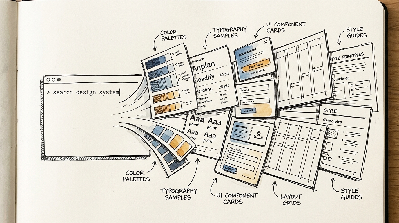
It's a skill for Claude Code that gives AI comprehensive design knowledge:
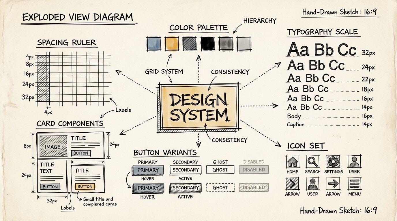
| Database | Count | |----------|-------| | UI Styles | 67 styles (glassmorphism, minimalism, brutalism, neumorphism...) | | Color Palettes | 96 sets (categorized by product type) | | Font Pairings | 57 pairs (all free Google Fonts) | | UX Guidelines | 99 rules (accessibility, interaction, performance...) | | Chart Types | 25 types (matched to data type) | | Tech Stacks | 13 stacks (React, Next.js, Vue, Svelte, Flutter, SwiftUI...) |
All searchable — one command gives you a complete design system with reasoning for every decision.
Before vs After — The Difference Is Clear
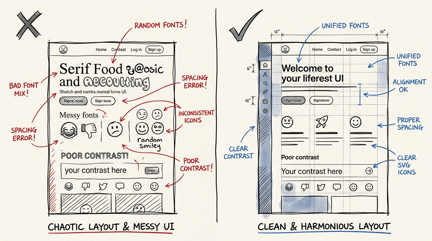
Before (Chaotic UI)
- ❌ Random fonts — Serif mixed with Sans-serif, no hierarchy
- ❌ Colors don't harmonize — picked randomly without a palette
- ❌ Inconsistent spacing — padding is 8px here, 20px there
- ❌ Emoji as icons — 🎨 🚀 ⚙️ looks unprofessional
- ❌ Insufficient contrast — hard to read on mobile
After (Professional UI)
- ✅ Clear typography hierarchy — heading, body, caption
- ✅ Harmonized, accessible color palette
- ✅ Consistent spacing system (4px, 8px, 16px, 24px, 32px)
- ✅ SVG icons from Lucide/Heroicons
- ✅ WCAG contrast ratio of 4.5:1 or higher
How It Works — 4 Simple Steps
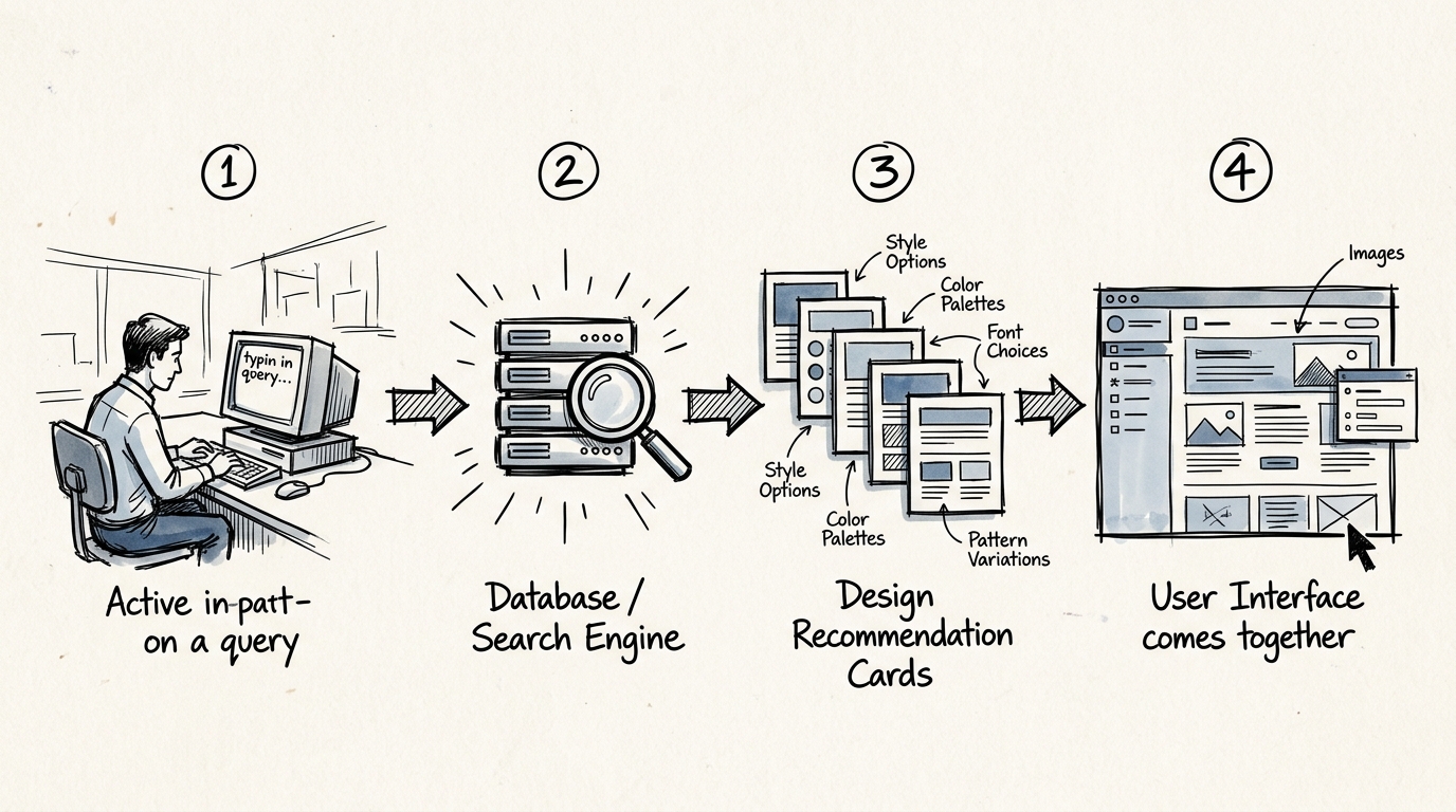
Step 1: Describe What You Need
Simply explain what you're building:
"Build a landing page for a fintech SaaS that looks professional and trustworthy"
Step 2: Skill Searches 5 Domains Simultaneously
The system searches its comprehensive database:
- Product type → recommends patterns suited for fintech
- Style → selects styles that convey trust (e.g., Minimalism + Corporate)
- Color → fintech palette (deep blue, emerald, slate)
- Typography → professional font pairing (Inter + DM Sans)
- Landing → page structure (Hero → Social Proof → Features → Pricing → CTA)
Step 3: Get a Complete Design System
The result is a ready-to-use design system:
Design System: FinTrust
├── Style: Minimalism + Corporate Glassmorphism
├── Colors: Primary #1E40AF, Accent #059669, Surface #F8FAFC
├── Typography: Inter (heading) + DM Sans (body)
├── Spacing: 4px base unit
├── Effects: Subtle shadow, frosted glass cards
└── Anti-patterns: ❌ No neon colors, ❌ No playful fonts
Step 4: Claude Code Builds UI Following the Design System
Claude implements everything according to the design system — every component uses the same colors, fonts, and spacing. No inconsistencies.
A Design System That "Thinks" — Not Just Random Output
What makes UI/UX Pro Max different from "AI generating random UI" is the reasoning behind every decision:
Priority-based Rules
CRITICAL — Never skip these:
- 1. Accessibility — contrast ratio, alt text, aria-labels, keyboard navigation
- 2. Touch & Interaction — touch targets 44x44px minimum, loading states, error feedback
HIGH — Very important:
- 3. Performance — image optimization, reduced motion, no content jumping
- 4. Layout & Responsive — viewport meta, font size 16px+, no horizontal scroll
MEDIUM — Pay attention:
- 5. Typography & Color — line-height 1.5+, line-length 65-75 chars, harmonious font pairing
- 6. Animation — duration 150-300ms, use transform/opacity only
- 7. Style Selection — match style to product type, consistent across all pages
LOW — Polish:
- 8. Charts & Data — chart type matches data type, accessible colors, table alternative provided
Accessibility and touch targets are CRITICAL — meaning Claude will never create UI with low contrast or buttons too small to tap on mobile.
Built-in Anti-patterns
The skill enforces guards against common mistakes:
- ❌ No emoji as icons — must use SVG from Lucide or Heroicons
- ❌ No hover effects that shift layout — use color/opacity instead of scale
- ❌ No
bg-white/10in light mode — too transparent to read - ❌ No mixed container widths — use consistent
max-w-6xlacross the app - ❌ No transitions over 500ms — use 150-300ms for micro-interactions
Who Benefits? — The Entire Team, Not Just Designers
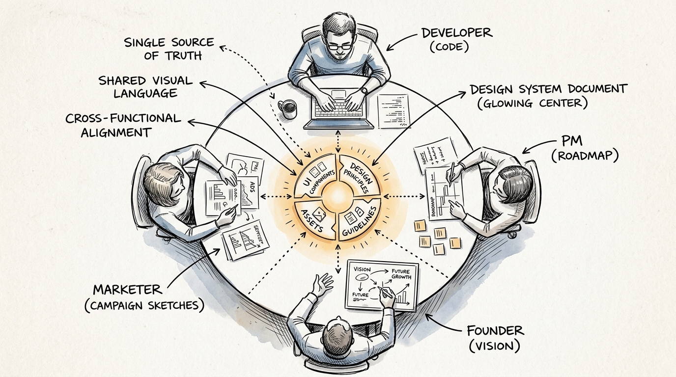
Developers Without Design Background
- Build professional-looking UI immediately
- No guessing fonts, colors, or spacing
- Confidence that accessibility standards are met
PMs / Product Owners
- Prototype ideas faster
- Communicate with stakeholders using real UI, not wireframes
- Make data-informed design decisions
Founders / Solo Builders
- Build MVPs that look trustworthy
- No need to hire a designer for v1
- Design system ready to scale when the team grows
Designers
- Use as a starting point, then customize
- Automate repetitive work (generating variants, documentation)
- Focus time on strategy and research instead
13 Supported Tech Stacks
The skill doesn't just say "use this color and font" — it provides stack-specific implementation guidelines:
Web:
- HTML + Tailwind — utility classes, responsive patterns, a11y best practices
- React — state management, hooks, performance patterns
- Next.js — SSR, Image optimization, App Router
- Vue — Composition API, Pinia, Vue Router
- Svelte — Runes, stores, SvelteKit
- shadcn/ui — component theming, forms, patterns
Mobile:
- React Native — mobile components, navigation, lists
- Flutter — widgets, state management, theming
- SwiftUI — views, state, navigation, animation
- Jetpack Compose — composables, modifiers, state hoisting
Pre-Delivery Checklist — Nothing Slips Through
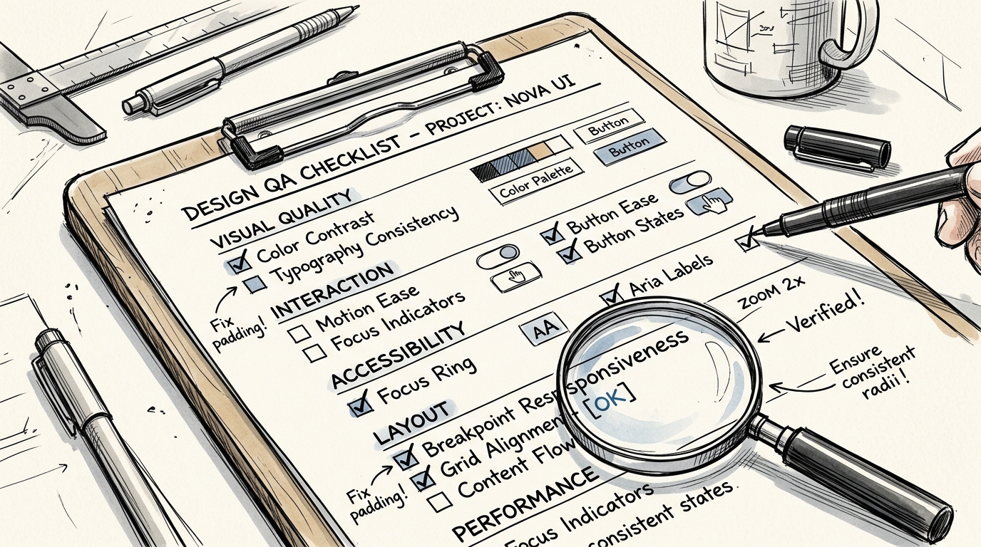
Every time Claude Code finishes building UI, the skill enforces a checklist:
Visual Quality ✓
- No emoji used as icons
- All icons from a consistent set (Lucide/Heroicons)
- Hover states don't cause layout shift
Interaction ✓
- All clickable elements have
cursor-pointer - Transitions are 150-300ms
- Focus states are clearly visible
Accessibility ✓
- Color contrast 4.5:1 or higher
- All images have alt text
- Form inputs have labels
prefers-reduced-motionrespected
Layout ✓
- Responsive at 375px, 768px, 1024px, 1440px
- No horizontal scroll on mobile
- Content not hidden behind fixed navbar
Why UI/UX Pro Max Is a Game Changer
Before this, building good UI required:
- An experienced designer
- A design system that's built and maintained
- Time for multiple iteration rounds
UI/UX Pro Max Skill puts all of this into a single Claude Code command — a design intelligence database of 300+ entries with reasoning that explains "why this choice" and a checklist that prevents mistakes.
It doesn't replace designers — it ensures everyone on the team can produce quality UI from day one.
"The best design system is one the team actually uses — UI/UX Pro Max makes it happen automatically."
Want to learn the UX principles behind great design systems? Check out my UX Knowledge Guide with 45 topics or book a free Design System consultation.
Free UX Consultation
Fill in a few details and I'll reach out via LINE or Email