Auto Layout + Shared Components: Building a Figma Design System That Actually Scales
A practical guide to using Auto Layout and Shared Components in Figma to create consistent designs across multiple projects — from real-world experience managing enterprise-level Design Systems.
Why Auto Layout Matters
If you're still designing in Figma by manually dragging elements into position — you're working like it's 2020.
Auto Layout is a Figma feature that makes elements inside a frame arrange themselves automatically — like CSS Flexbox, but in Figma. No code required.
Why it matters:
- Resize without breaking — change the width and everything adjusts automatically
- Add or remove content freely — add another item to a list without manually nudging everything
- Consistent spacing — padding and gaps are fixed values that never drift
- Developers understand it instantly — because Auto Layout works just like the Flexbox they already use
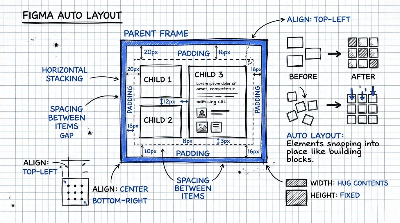
Auto Layout 101: Starting from Zero
Horizontal vs Vertical Layout
There are only 2 directions:
- Horizontal (→) — elements line up side by side, like
flex-direction: row - Vertical (↓) — elements stack top to bottom, like
flex-direction: column
Padding = "Edge Spacing"
Padding is the space between the frame's edge and its inner content.
- Set equally on all sides:
padding: 16 - Set individually:
top: 24, right: 16, bottom: 24, left: 16
Gap = "Space Between Items"
Gap is the distance between each element inside the frame.
- Common values:
8,12,16,24 - Always use values from your design system's spacing scale
Alignment
Controls how items position themselves within the frame:
- Top-left, Center, Bottom-right, etc.
- Space between — distribute evenly (like
justify-content: space-between)
Nested Auto Layout: Building Complex UI from Small Pieces
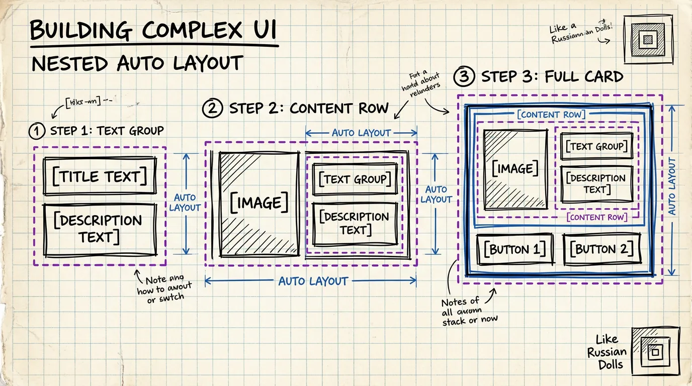
The real power of Auto Layout is nesting multiple layers — like LEGO blocks.
Example: Building a Product Card
Layer 1 — Text Group (Vertical)
[Title]        ← text, bold
[Description]  ← text, regular
Gap: 4px
Layer 2 — Content Row (Horizontal)
[Image] [Text Group]
Gap: 12px
Alignment: center
Layer 3 — Card Body (Vertical)
[Content Row]
[Price + CTA Button]
Gap: 16px
Padding: 16px
Layer 4 — Full Card (Vertical)
[Hero Image]    ← fill width
[Card Body]
Gap: 0
Border radius: 12px
Every layer is an Auto Layout frame that resizes independently — add 2 more lines of description and the card grows automatically. Shrink the width and everything reflows.
Key Principles
- Build inside-out — create the smallest pieces first, then combine them
- Every layer must be Auto Layout — any non-Auto Layout layer is where things break on resize
- Name your layers clearly —
Card/Body,Card/Content-Row,Card/Text-Group— notFrame 47
Shared Components: The Heart of Multi-Project Design
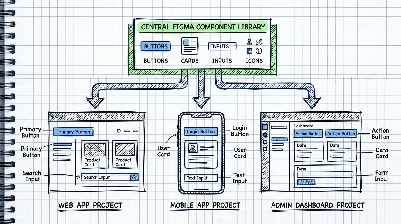
Auto Layout makes components flexible. But if every project creates its own components, they'll diverge over time until nothing matches.
How to Set Up a Shared Library
Step 1: Create a Separate Figma File for the Library
Don't put components inside project files — create a dedicated file that serves as your "Single Source of Truth."
📁 Design System Library (Figma file)
├── 🎨 Colors & Tokens
├── 📝 Typography
├── 🔲 Icons
├── 🧩 Components
│   ├── Button
│   ├── Input
│   ├── Card
│   ├── Modal
│   ├── Navigation
│   └── ...
└── 📐 Layout Patterns
Step 2: Publish as a Team Library
In Figma, go to the Assets panel → Publish library. Every project in your team will see this library and can drag components in.
Step 3: Enable the Same Library in Every Project
Project A (Web App)       → Enable "Design System Library"
Project B (Admin Panel)   → Enable "Design System Library"
Project C (Mobile App)    → Enable "Design System Library"
When you update a component in the Library, every project gets a notification to update — consistency on autopilot.
Component Variants: One Component to Rule Them All
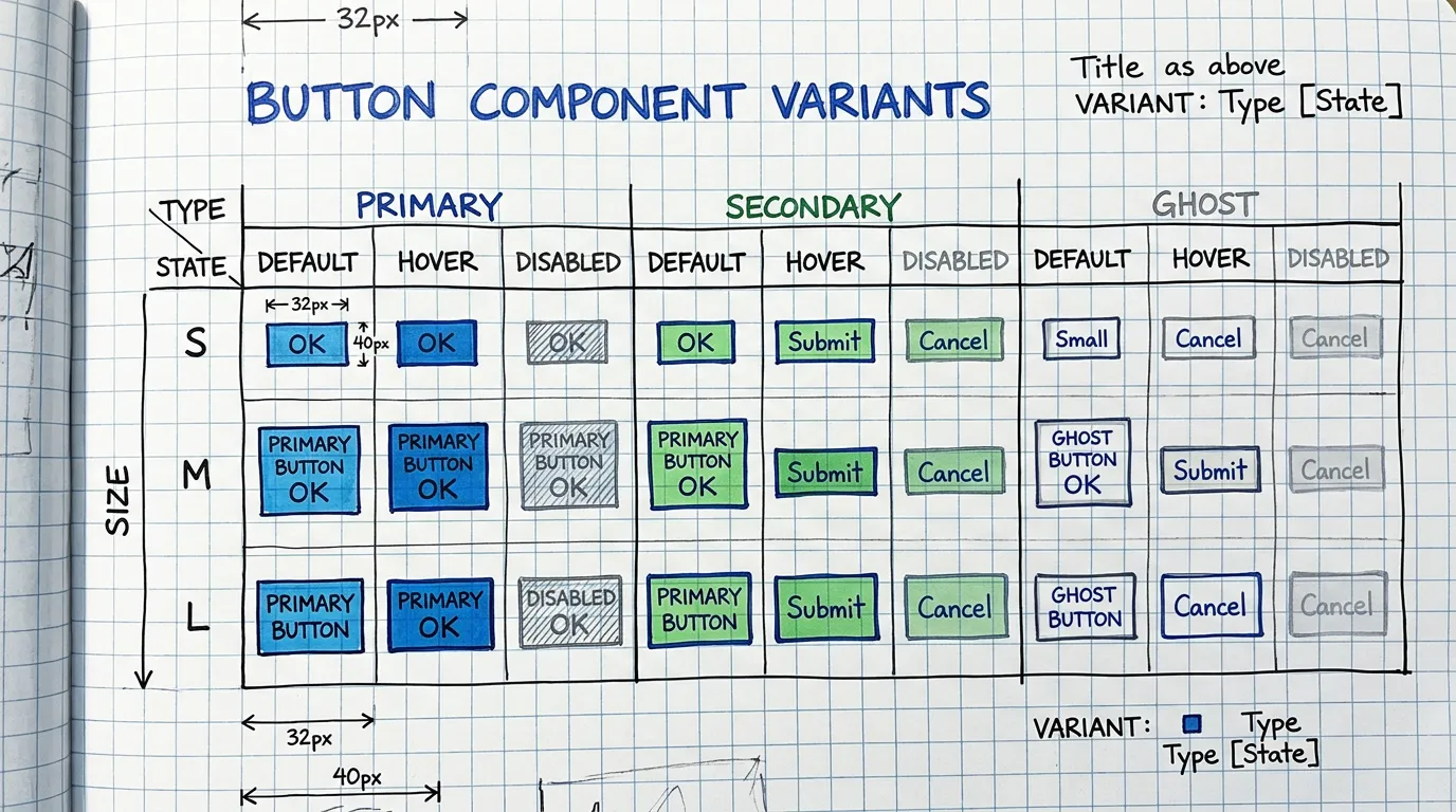
A good component covers every use case — you shouldn't need to create a new component every time.
Example: Button Component
Using Figma's Component Properties:
Variant Properties:
- Type: Primary / Secondary / Ghost / Danger
- Size: Small (32px) / Medium (40px) / Large (48px)
- State: Default / Hover / Pressed / Disabled
Boolean Properties:
- Show Icon: true / false
- Show Badge: true / false
Instance Swap Properties:
- Icon: swap in any icon for context
Text Properties:
- Label: change text directly on the instance
The Result
From 1 component, you get buttons for every scenario:
- Primary Large with icon → main CTA button
- Secondary Small without icon → action button in a table
- Ghost Medium → cancel button in a modal
- Danger Medium → delete button
No new components. No detaching instances. No style overrides.
Auto Layout + Components = Responsive Design
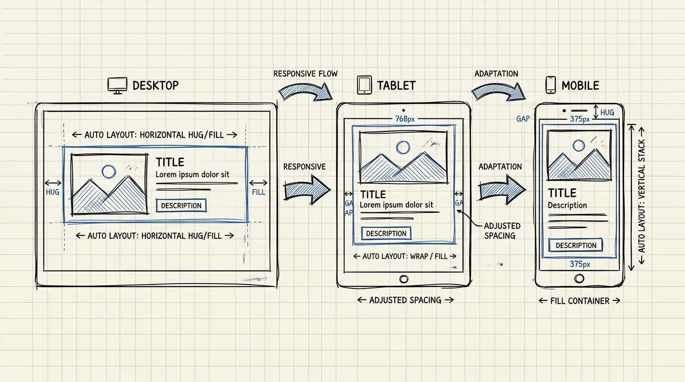
When components use Auto Layout correctly, they become naturally responsive.
Resizing Behavior
Controls how an element resizes when its parent changes size:
- Fixed — stays the same size regardless of parent
- Fill — expands to fill remaining space (like
flex: 1) - Hug — shrinks to fit its content (like
width: fit-content)
Example: A Responsive Card
Card (Vertical Auto Layout, Fill width)
├── Image (Fill width, Fixed height: 200px)
├── Body (Vertical Auto Layout, Hug height)
│   ├── Title (Fill width, Hug height)
│   ├── Description (Fill width, Hug height)
│   └── Actions (Horizontal Auto Layout, Fill width)
│       ├── Price (Hug width)
│       └── Button (Hug width)
- Desktop (360px wide): Card displays normally, text and button sit side by side
- Mobile (280px wide): Narrower, text wraps, button stays next to price
- List view (600px wide): Wider, content spreads out elegantly
No need to design 3 separate breakpoints — Auto Layout handles it.
Best Practices for Multi-Project Design Systems
1. Establish Clear Naming Conventions
Use / to create hierarchy in the Assets panel:
Button/Primary/Large
Button/Primary/Medium
Button/Secondary/Large
Card/Product/Horizontal
Card/Product/Vertical
Input/Text/Default
Input/Text/Error
Every project sees components organized cleanly — no hunting through long lists.
2. Use Design Tokens
Don't hardcode color and spacing values — use Figma Variables:
- Colors:
primary/500,neutral/100,danger/600 - Spacing:
space/4,space/8,space/16,space/24 - Border Radius:
radius/sm,radius/md,radius/lg
When you need to rebrand or change themes, just update the token values — every component in every project updates instantly.
3. Document Components in Figma
Every component should have:
- Description — when to use it
- Usage guidelines — dos and don'ts
- Link to code — if using Code Connect, link to the codebase component
4. Version Control
- Use Branches in Figma when making major component updates
- Review before merging, just like a code PR
- Changelog — record what changed in each version
5. Create Template Pages
Beyond components, create page templates assembled from shared components:
📄 Templates
├── Dashboard Layout
├── Settings Page
├── Form Page
├── List/Table Page
└── Empty State
When starting a new project, just duplicate a template and customize — no starting from scratch.
Lessons from Managing a Design System Across Multiple Projects
What Works Well
- 40–50% less design time — no rebuilding components from scratch
- Automatic consistency — every project uses the same components
- Faster onboarding — Juniors start producing immediately with ready-made components
- Easier handoff — developers inspect one component and use it everywhere
Watch Out For
- Don't over-engineer — start with frequently-used components (Button, Input, Card), don't try to build everything upfront
- Maintain regularly — a library that doesn't get updated is a library nobody uses
- Listen to team feedback — if people keep detaching instances, your components aren't flexible enough
- Don't force adoption — let people see the benefits themselves rather than making it feel like a burden
Wrap Up
Auto Layout + Shared Components isn't "nice to have" — it's the foundation that lets design teams actually scale.
Start simple:
- Convert your most-used components to Auto Layout
- Create a separate Library file
- Publish it as a Team Library
- Enable the same library in every project
- Gradually add components by priority
It doesn't have to be perfect on day one — just start today.
Free UX Consultation
Fill in a few details and I'll reach out via LINE or Email